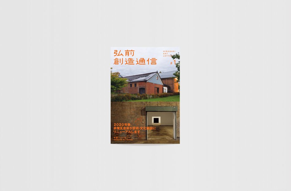
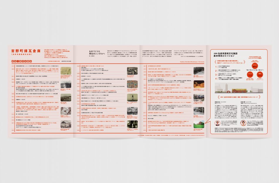
“Yoshino-cho brick warehouse” in Hirosaki City, Aomori Prefecture,
which was the exhibition site of “A to Z” handed down by Mr. Yoshitomo Nara.
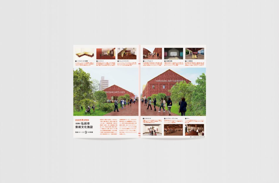
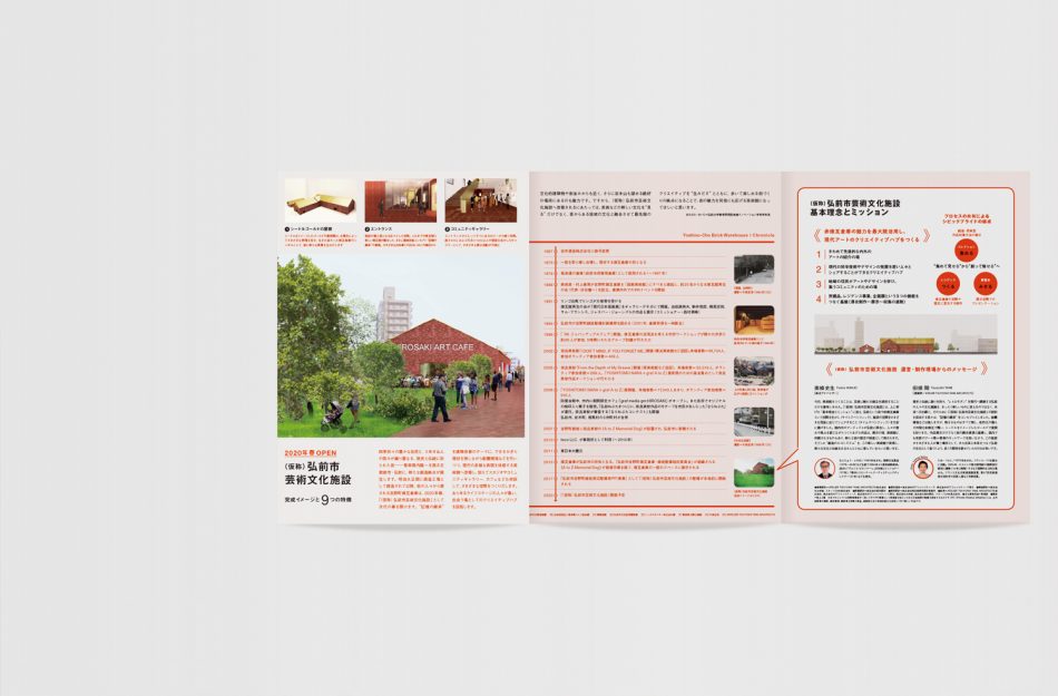
In the spring of 2020 that it will be born into an arts and culture facility.
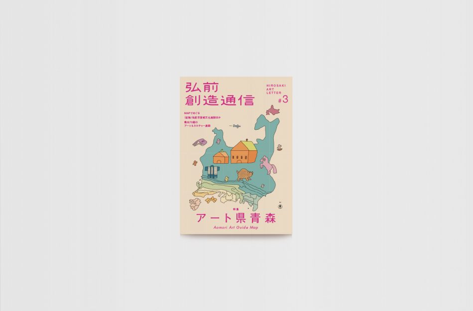
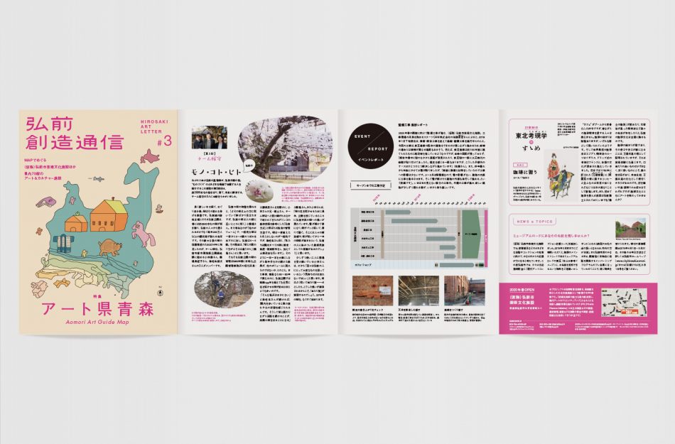
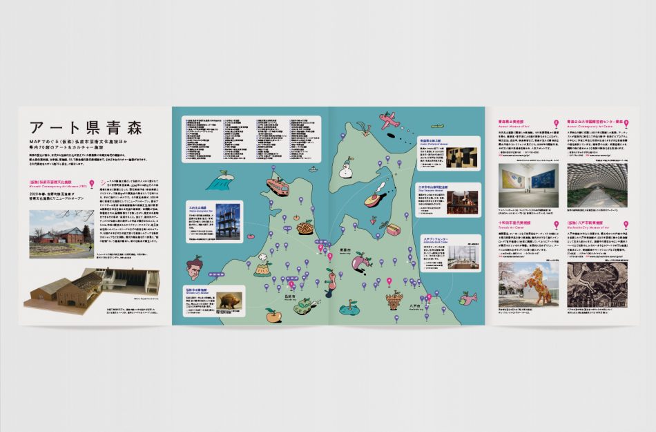
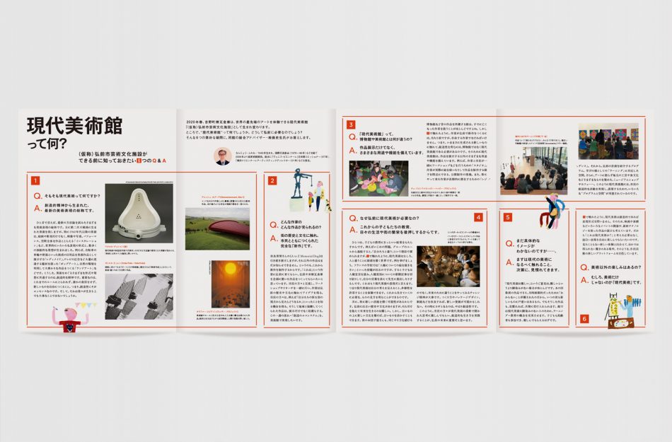
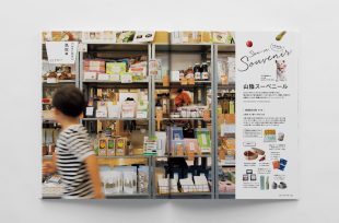
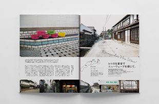
I am in charge of designing the announcement flyer. We plan to publish
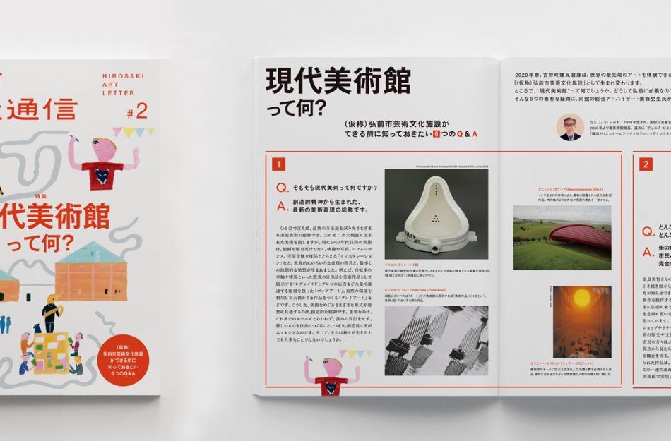
5 times in total by the spring of 2020.
I want you to be interested widely from local young people to elderly people.
The design is not too much over the culture, soft things.
奈良美智さんが手がけた「A to Z」の展示会場となった青森県弘前市にある「吉野町煉瓦倉庫」。
2020年春に向けて、芸術文化施設に生まれるということで
その告知フライヤーのデザインを担当。2020年春までに計5回刊行予定。
地元の若年層からお年寄りまで幅広く興味をもってもらうよう
デザインはカルチャーよりになりすぎないこと、柔らかなものに。
Design:渡辺和音(ThereThere)
Edit:岡澤浩太郎
