News

FRaU 2018年12月号

Art direction and design for the December 2018 issue of single-theme magazine “FRaU.” 

Entitled “Secrets of San’in,” this special issue is devoted to the San’in region of Japan.

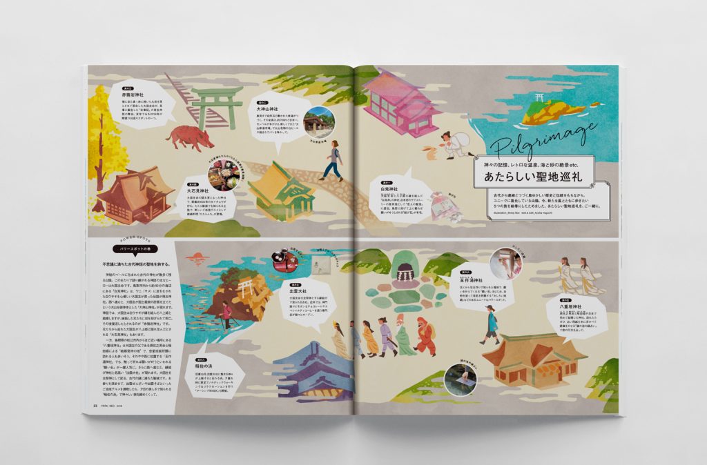
To express the intriguing, mystical impression of the San’in region in a playful and modernistic way, the design centered around a handwritten style.


講談社が刊行するワンテーママガジン「FRaU」2018年12月号の
アートディレクション・デザインを担当。
「秘密の山陰へ」と題し、山陰地方の特集になっています。

山陰のもつどこか不思議で神秘的な印象を軽やかで現代的に表現するため
手書きを軸としたデザインとした。


Executive producer:Tatsuhiko Seki
Editor in chief:Maki Tsuga(euphoria FACTORY)
Art director:Kazunewatanabe(ThereThere)
Editor:Yuriko Kobayashi / Shiho Nakamuro / Ayana Yamaguchi / Kaori Ezawa
Designer:Sumire Kobayashi / Sayaka kojima(althouse)

豊岡市立図書館

Upon the renovation of the Toyooka City Library in Toyooka City, Hyogo Prefecture,

logos and signage were designed for new areas of the library. 

In the “Relaxation Room,” visitors can take a break and freely use the space to chat,

eat, or enjoy WiFi access.

In the “Relaxation Garden,” leisurely pass the time on the grass or on the wooden deck.

The logo of the “Relaxation Room” comprises symbols which denote the room’s various uses, making it easy to understand what kind of space it is at a glance. 

In the same way, the two logos of the “Relaxation Garden” were designed to coexist

for a space where visitors can enjoy both reading time and nature.


兵庫県豊岡市の豊岡市立図書館リニューアルにあたり

館内に新設した新しい試みのスペースのロゴ・サインをデザイン。

おしゃべりや飲食が可能・Wifiが利用でき、休憩したい時など

自由に利用できる「いこいの間」

芝生やウッドデッキでゆったりとした時間を過ごせる「いこいの庭」

「いこいの間」の多目的な用途に合わせ

用途毎にアイコン化し組み合わせることで、どんなスペースなのかということが

一目でわかるようなロゴに。

また同じように「いこいの庭」は本とともに自然を感じるものにし、

二つのロゴが共存できるようなデザインにした。


Produce・Edit:BACH
space design:E&Y
Logo Sign Design:ThereThere