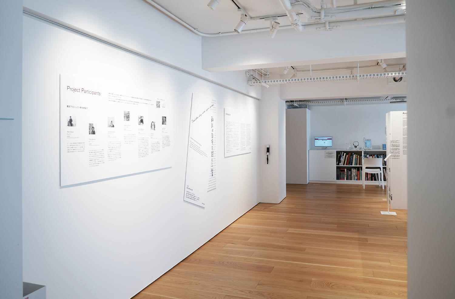
翻訳プロジェクト小展示「翻訳は国境を越える翼」

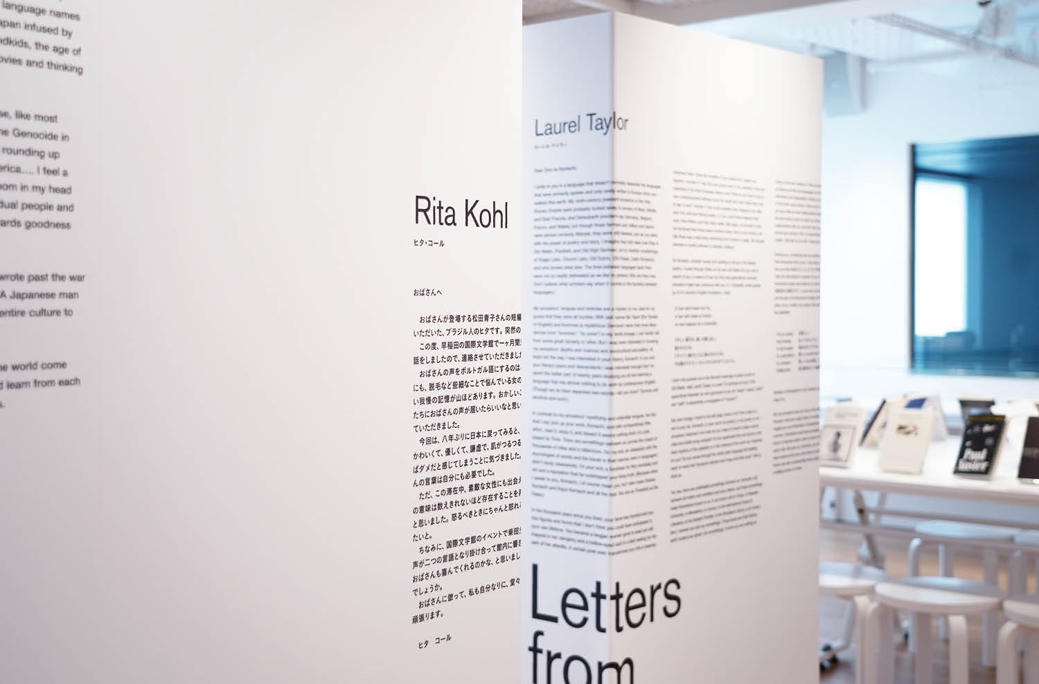
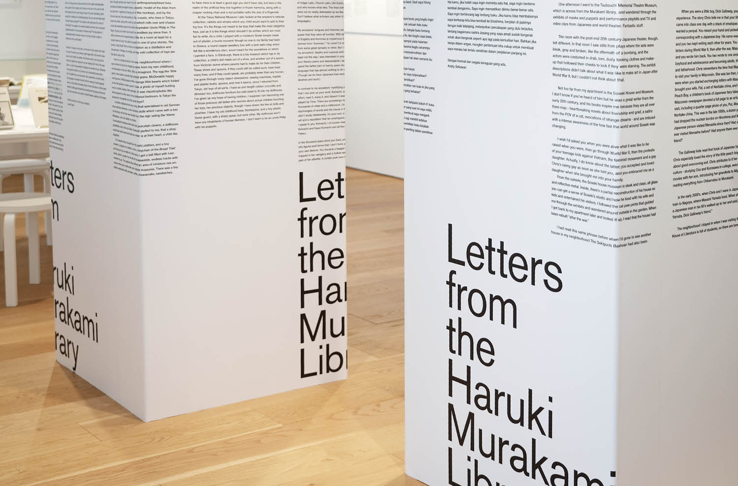
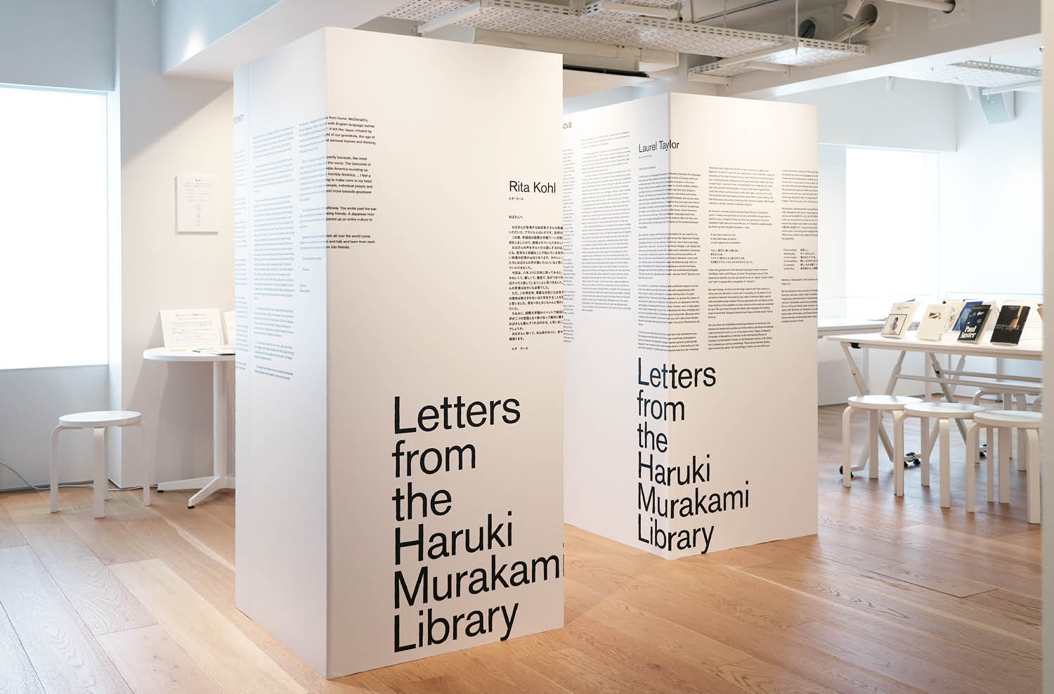
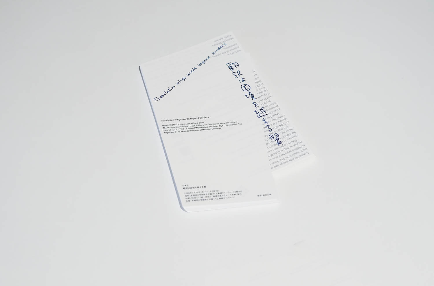
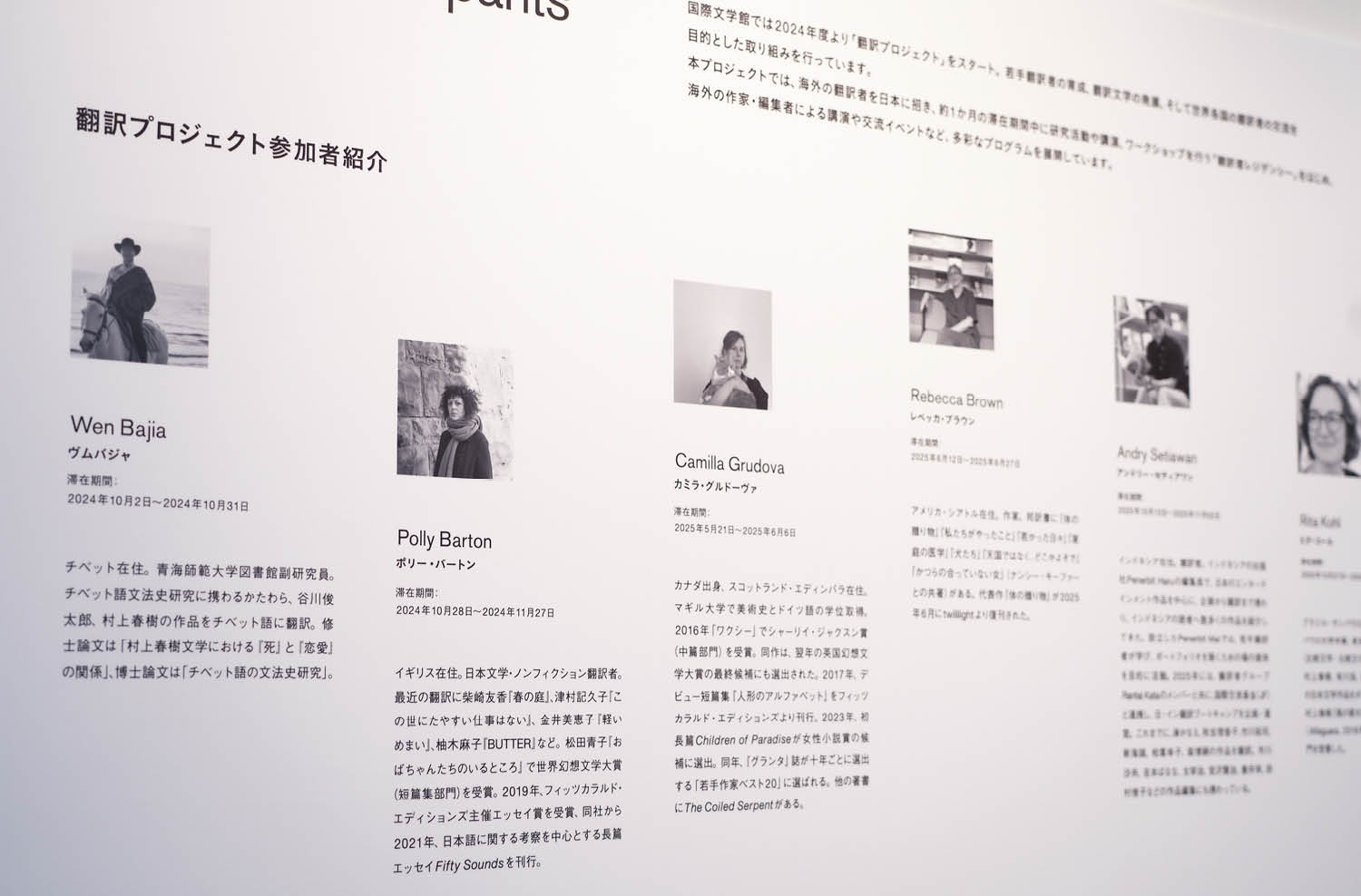
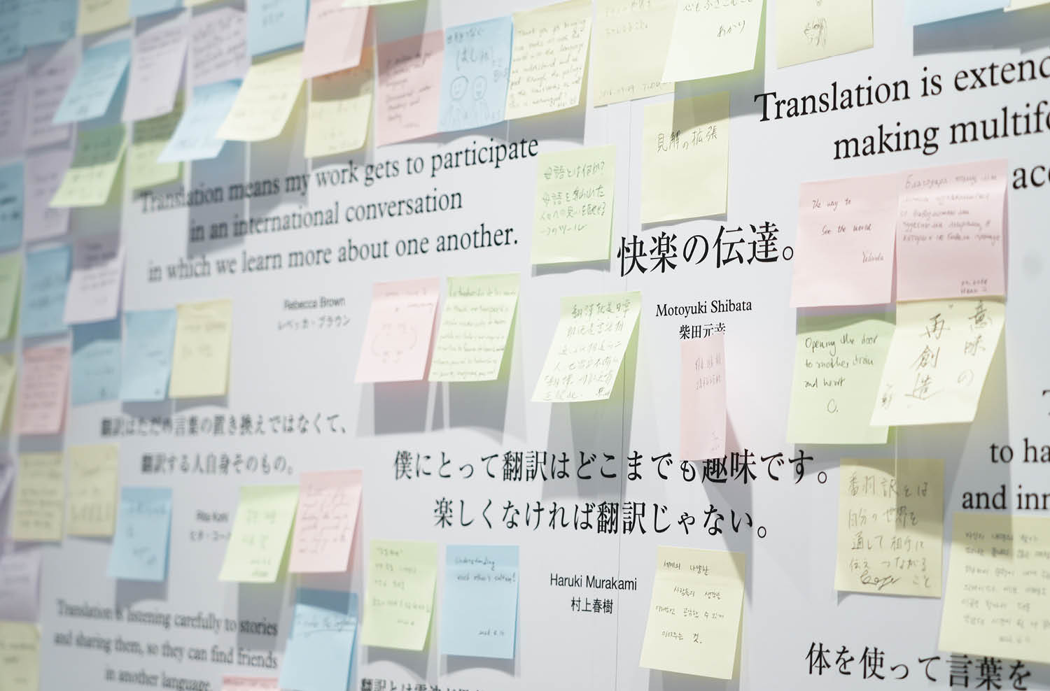
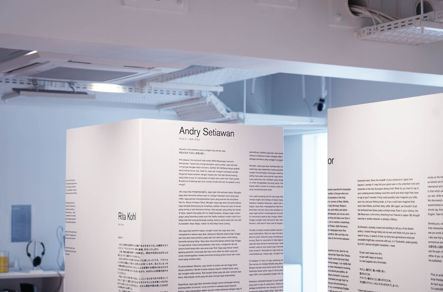
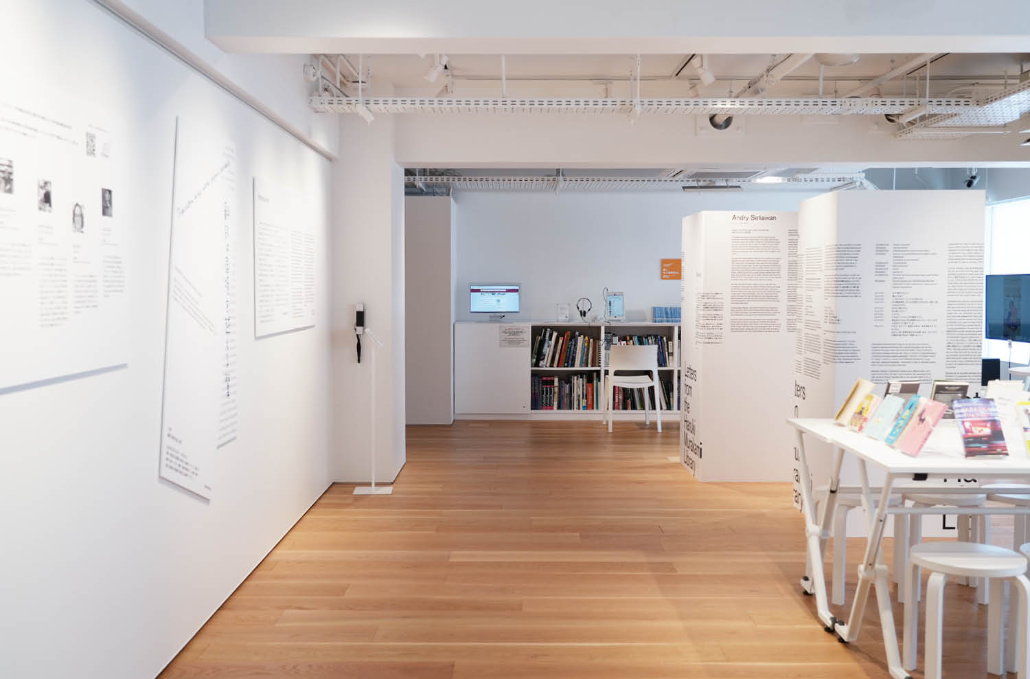
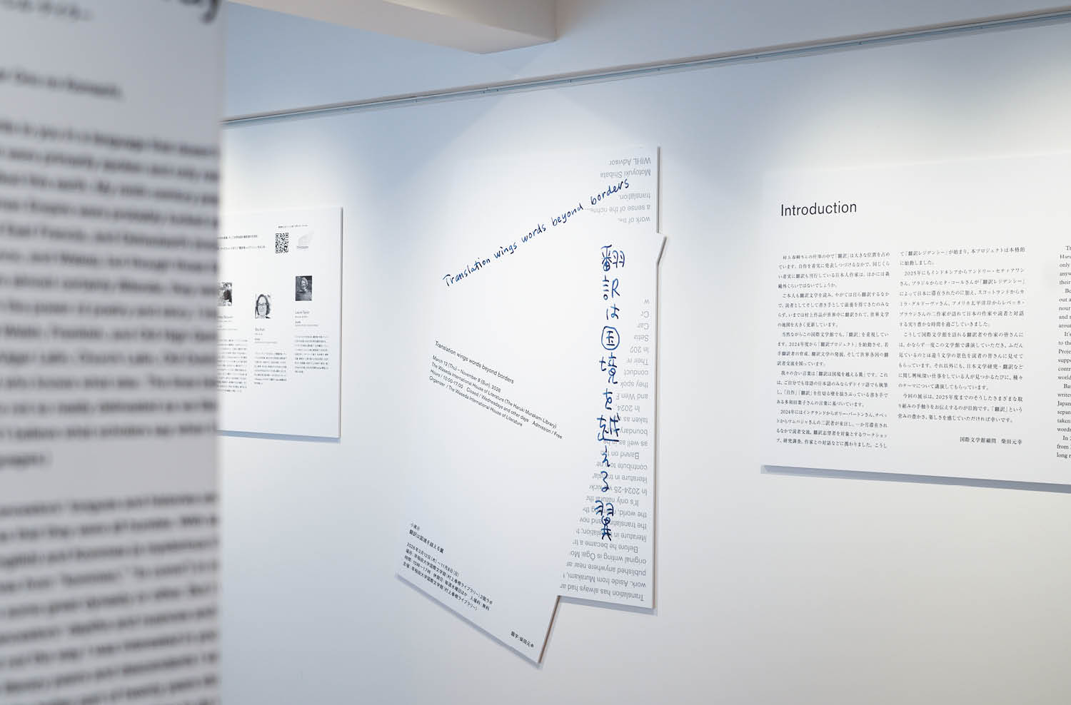
We designed a small exhibition on translation, centered around Motoyuki Shibata, at the Waseda International House of Literature.

Inspired by the way translation allows words to cross borders,
the graphics were developed around the image of crossing the boundary between two surfaces.

The title lettering was created by Shibata himself.

If you visit the museum, please stop by and take a look.


早稲田大学国際文学館の小スペースにて、柴田元幸さんを中心とする翻訳の小展示のデザインを担当。

翻訳によって言葉が国境を越えていくように、
二つの面の境界線を越えていくイメージで、グラフィックを展開した。

手書きの題字は柴田元幸氏によるもの。
 

Art Direction / Design :There There

Client:早稲田大学国際文学館(村上春樹ライブラリー)
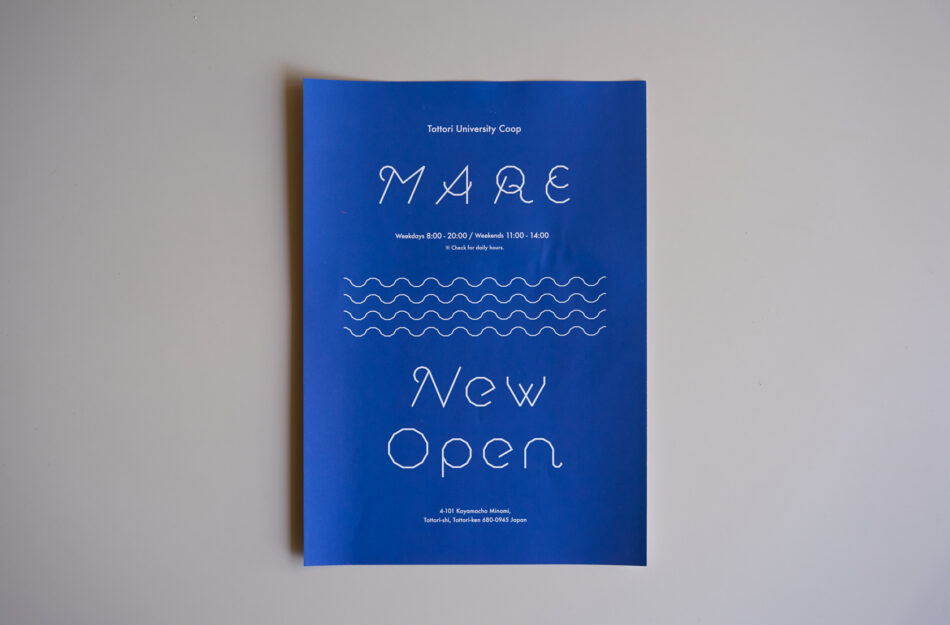
鳥取大学 学生食堂MARE

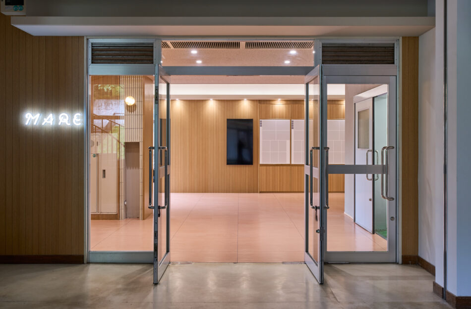
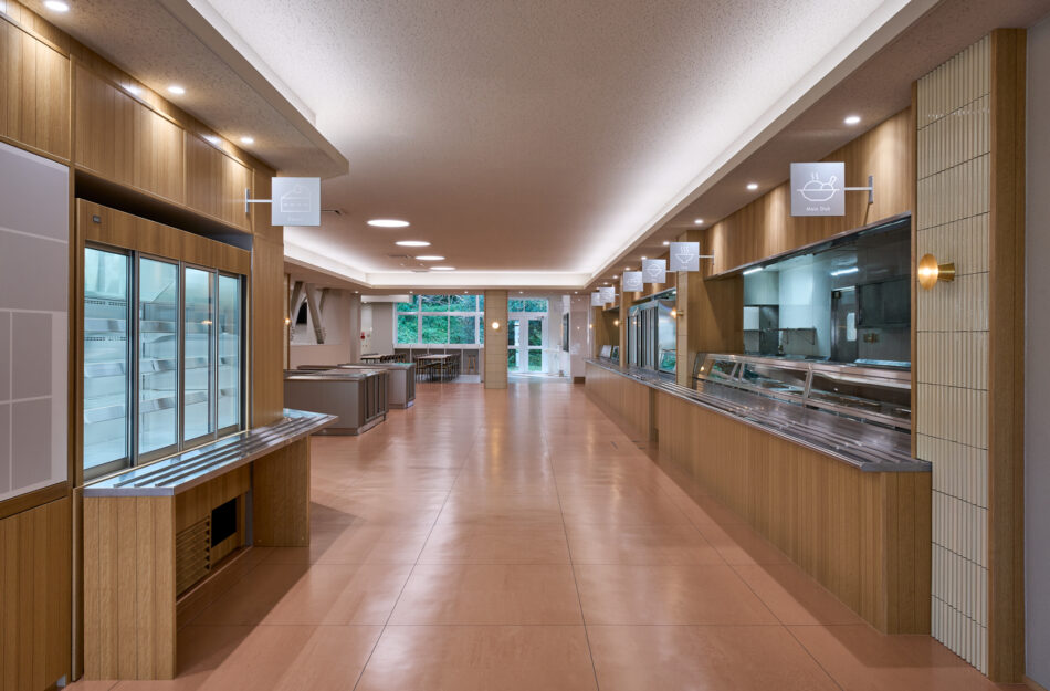
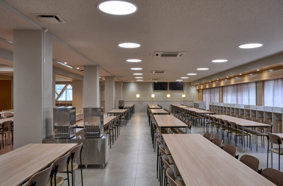
The university cafeteria “MARE” has reopened at Tottori University.
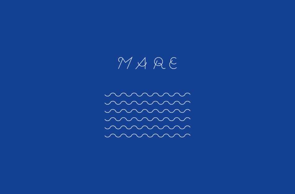
“MARE” means “sea” in Latin, and is also derived from the initials of the university’s four faculties.
As a student cafeteria used on a daily basis, it serves as a place for both dining and interaction on campus.
This project is positioned as the third installment in the series, following “Hill Peak” and “Hill Peak Garden.”
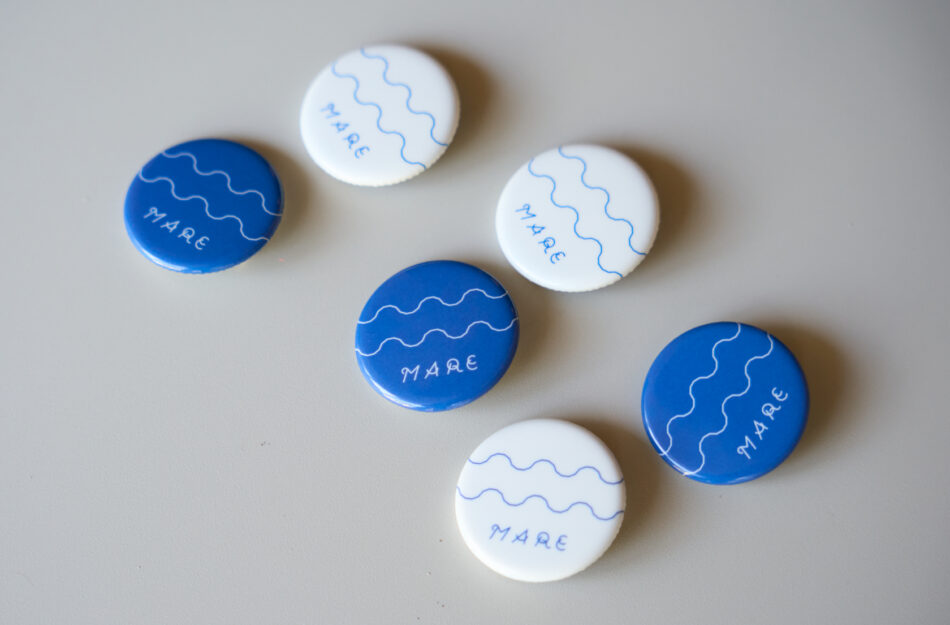
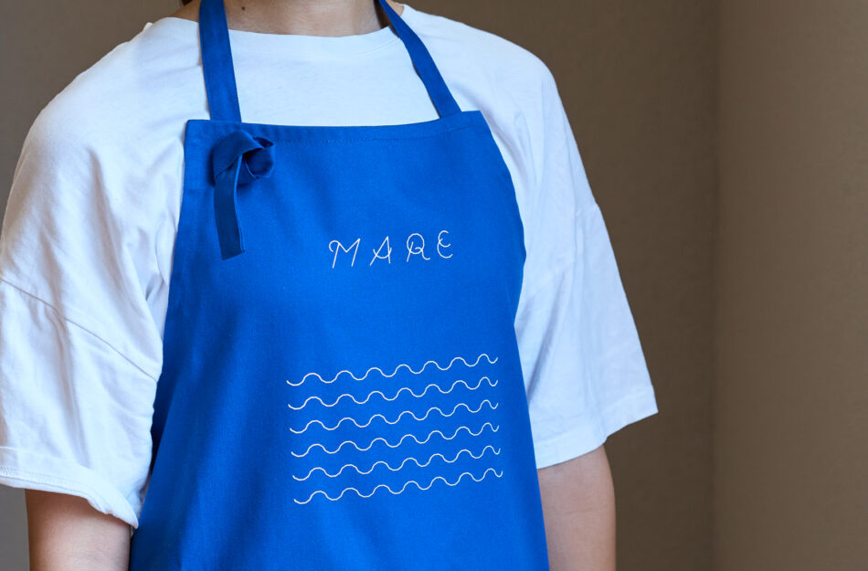
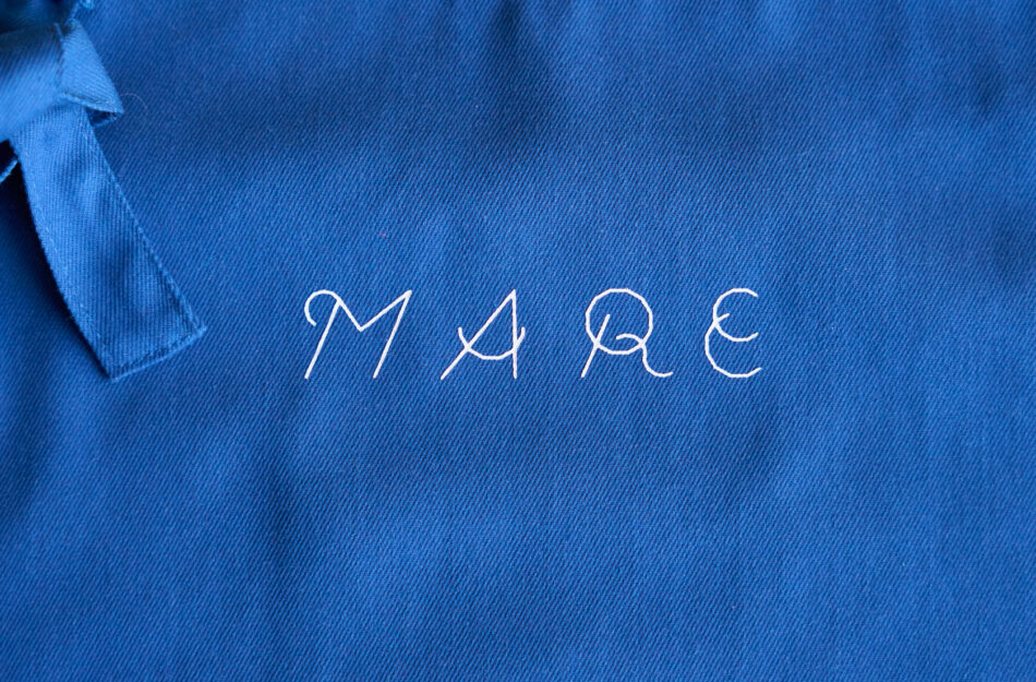
For the graphics, an original typeface based on a dodecagon was developed.
By combining the forms, it creates wave-like patterns.
The key color is blue, derived from the name “MARE.”


「MARE」はラテン語で「海」を意味するとともに、鳥取大学の4学部名の頭文字から名付けられた。
日常的に利用される学生食堂として、学内の食事と交流の場となっている。

本プロジェクトは、第1弾「ヒルピーク」、第2弾「ヒルピークガーデン」と続く、プロジェクトの第3弾として位置付けられている。

グラフィックでは、12角形をベースにしたオリジナルフォントを制作。
組み合わせることで波形のような形状をつくる設計。
キーカラーには、「MARE」の名称に由来するブルーを採用。


Produced by:鳥取大学生活協同組合
Design Supervision:STUDIOMOVE.Co.,Ltd
Lighting Design:株式会社遠藤照明
Lighting Supplier:株式会社フジコー
Curtains:ファブリックスケープ
Construction:ティー・シー・シー
Art Direction / Graphic:There There